Designing Human-in-the-Loop AI: UX Patterns for Uncertainty
Here's a number that should terrify every PM building AI products: 95% accuracy means 1 in 20 interactions will be wrong. At 1,000 daily users, that's 50 people per day getting bad information, wrong recommendations, or failed automations. The model isn't the problem—your UX is. The products that win the AI era won't have the best models. They'll have the best UX for handling uncertainty.

The fundamental problem: Computers shouldn't be uncertain
For 50 years, software has been deterministic. Click a button, get a result. Every time. Users have been trained to trust software outputs implicitly. When your calculator says 247 × 38 = 9,386, you don't double-check. When Google Maps says turn left, you turn left.
AI breaks this contract. The model might be right 19 out of 20 times, but there's no visual difference between the 19 correct responses and the 1 wrong one. The text looks equally confident. The UI presents it identically. The user has no signal for when to trust and when to verify.
This is the core UX challenge: how do you design an interface that communicates "I'm probably right but you should check" without making the user feel like the product is useless?
Pattern 1: Confidence indicators
Show the user how confident the AI is in its output. This is the most direct approach to communicating uncertainty.
Implementation approaches
- Visual confidence scores: A colored bar or badge (green/yellow/red) alongside the AI's response. Gmail's Smart Reply uses this implicitly—suggestions that the model is less confident about simply aren't shown.
- Linguistic hedging: Train or prompt the model to express uncertainty in its language: "Based on the available data, this is likely..." vs. "This is definitely..." This feels more natural than a numerical score but is harder to calibrate.
- Source attribution: Show which documents or data points the AI used. "Based on your Q3 report (page 14) and the pricing policy updated January 2026." This lets the user assess credibility by evaluating the sources, not the AI itself.
Design considerations
Confidence scores must be calibrated. If 80% confidence means "I'm right 80% of the time," that's useful. If 80% confidence means "I'm right 95% of the time," the score is misleading. Calibrating confidence is a technical challenge—work with your ML team to validate that displayed confidence correlates with actual accuracy.
Also consider the audience. Power users might appreciate a numerical confidence score. General consumers will respond better to visual or linguistic cues. A medical professional wants to see "87% probability of diagnosis X based on symptoms A, B, C." A consumer health app user wants "This might be X, but you should see a doctor to be sure."
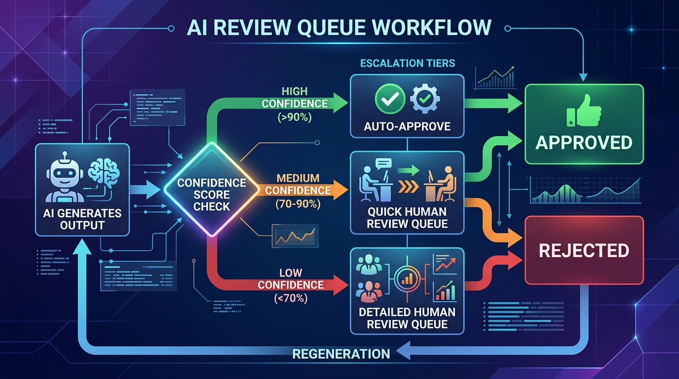
Pattern 2: Review queues and approval workflows
For high-stakes actions, don't let the AI execute autonomously. Instead, have it prepare a draft or recommendation that a human reviews before it goes live.
Examples in practice
- Customer support: The AI drafts a response to a customer ticket. The support agent reviews, edits if needed, and sends. Over time, as the agent builds trust, some response types might graduate to auto-send.
- Content generation: The AI generates a product description. A content editor reviews it in a queue, approves or edits, and publishes. The queue shows the AI's confidence and flags items it's less sure about.
- Financial operations: The AI categorizes expenses and prepares a reconciliation report. An accountant reviews flagged items before the books are closed.
Design the queue, not just the AI
The review queue is a product in itself. It needs:
- Prioritization: Surface the items most likely to be wrong first. Low-confidence items at the top.
- Diff view: Show what the AI changed or generated, highlighted against the original context. Don't make the reviewer read everything—show them what matters.
- One-click approval: If the AI is right (which it usually will be), make approval frictionless. The review flow should optimize for the common case (correct) while catching the uncommon case (incorrect).
- Feedback capture: When a reviewer edits an AI output, capture the edit. This is gold for improving the model. Was the edit factual? Stylistic? Structural? Each type of edit suggests a different improvement path.
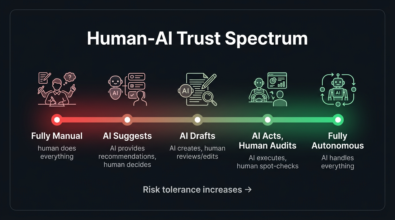
Pattern 3: Progressive disclosure of AI involvement
Not every user needs to know that AI is involved in every interaction. Sometimes the best UX is to let the AI work behind the scenes and only surface its involvement when it's relevant.
- Level 1 — Invisible AI: Autocorrect, spam filtering, recommended sort orders. The user benefits without knowing AI is involved. Appropriate when the AI is highly accurate and the stakes are low.
- Level 2 — Suggested AI: Smart replies, autocomplete suggestions, recommended actions. The AI proposes; the user decides. This is the sweet spot for most consumer products.
- Level 3 — Collaborative AI: The AI generates a draft and the user refines it. Co-authoring documents, editing code suggestions, reviewing analysis. Appropriate when the user has expertise and the task is creative or complex.
- Level 4 — Autonomous AI with oversight: The AI acts independently but provides a log of actions for review. Appropriate for repetitive, well-defined tasks where the user wants to verify rather than participate.
Choosing the right level of disclosure is a product decision that depends on trust, stakes, and user expertise. Getting it wrong in either direction—too hidden or too prominent—degrades the experience.
Pattern 4: Graceful fallbacks and error recovery
When the AI fails—and it will—the user experience of the failure determines whether they retry or leave. Graceful degradation isn't optional; it's the most important UX pattern for AI products.
Fallback hierarchy
- Admit uncertainty: "I'm not confident in this answer. Here's what I found, but you might want to verify with [source]."
- Offer alternatives: "I couldn't find an exact match, but here are related topics that might help."
- Escalate to a human: "This question is outside my expertise. Let me connect you with a specialist." Include the AI's context in the handoff.
- Fail informatively: "I encountered an error processing your request. Here's what I was trying to do: [summary]. You can try rephrasing, or contact support."
What you should never do: fail silently, return a confidently wrong answer, or show a generic error message with no context. Each of these destroys trust in ways that are hard to recover from.
Pattern 5: Undo and edit as trust builders
One of the most powerful UX patterns for AI uncertainty is also one of the simplest: let users undo and edit AI actions easily.
Gmail's "Undo Send" is one of the most beloved features in email—not because people constantly send wrong emails, but because knowing you can undo reduces the anxiety of hitting send. Apply this same principle to AI actions. The ability to reverse an AI decision makes users more willing to let the AI act in the first place.
- AI auto-categorized your expense? One click to change the category.
- AI scheduled a meeting? Easy reschedule or cancel.
- AI generated a summary? Inline editing right on the output.
- AI sent an auto-reply? "Undo" available for 30 seconds.
The easier it is to correct the AI, the more users will trust it to act autonomously. This sounds counterintuitive, but it's well-supported by UX research: perceived control increases trust.
Pattern 6: Teaching the user to collaborate with AI
Many users don't know how to get the best results from AI. They type vague prompts and get vague answers. They don't know they can ask for revisions. They don't realize that adding context improves output quality.
Build guidance into the experience:
- Prompt suggestions: Show example queries or templates. "Try asking: 'Summarize the key risks from the Q3 board deck'" is more helpful than an empty text box.
- Iterative refinement UI: After the AI responds, offer structured follow-up options: "Make it shorter," "Add more detail," "Change the tone to formal." This teaches users that AI interaction is iterative, not one-shot.
- Contextual tips: "Tip: Including the date range will help me give a more accurate answer" shown when the AI detects an ambiguous query.
Measuring HITL effectiveness
How do you know if your human-in-the-loop design is working?
- Override rate: How often do humans change the AI's output? If it's above 30%, the model needs improvement. If it's below 5%, you might be able to remove the human step for some categories.
- Time-to-approve: How long does the human review take? If reviewers are spending 10 seconds per item, the AI is doing its job. If they're spending 5 minutes, the AI output isn't good enough to be a useful starting point.
- Automation graduation rate: Over time, are more task types moving from "human review required" to "auto-approved"? This is a measure of both AI improvement and trust building.
- Error escape rate: When AI errors get past the human reviewer and reach the end user, how often does it happen? This measures the effectiveness of your review process, not just the model.
- User trust trajectory: Track how users' behavior changes over time. Do they increase their reliance on AI features? Do they move from "always editing" to "mostly approving"? This is the ultimate measure of a well-designed HITL system.
The north star: AI that earns trust
The ultimate goal isn't an AI that's perfect—it's an AI that's trustworthy. Trustworthiness isn't a model property; it's a system property that emerges from the combination of model capability, UX design, transparency, and user control.
The products that will define the AI era aren't the ones with the most capable models. They're the ones that make users feel confident using AI—confident that the AI is helping, confident that errors will be caught, and confident that they're always in control. That confidence is built through design, not algorithms.